
Appearance & Layout
Colors & Branding
The General settings control your platform’s visual identity, including colors, branding, and UI styling. These settings are applied globally across your website.
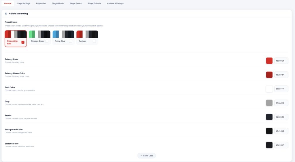
🎨 Preset Colors
Choose from predefined color schemes:
- 🔴 Streaming Red (Default OTT style)
- 🟢 Stream Green
- 🔵 Prime Blue
- ⚙ Custom Palette
👉 These presets quickly apply a consistent design across your platform.
🎯 Custom Color Options
Primary Color
Main brand color used for:
- Buttons
- Active elements
- Highlights
Primary Hover Color
Defines the hover state for interactive elements like buttons and links.
Text Color
Controls the main text color across your website.
Gray (UI Elements)
Used for:
- Cards
- Secondary text
- UI components
Border Color
Defines borders for:
- Cards
- Sections
- Containers
Background Color
Main background color of your site.
Surface Color
Used for:
- Cards
- Panels
- Content containers
💡 Best Practice
Use consistent color contrast for better readability and UX.
👉 Dark UI + bright accent color (like red) works best for OTT platforms
